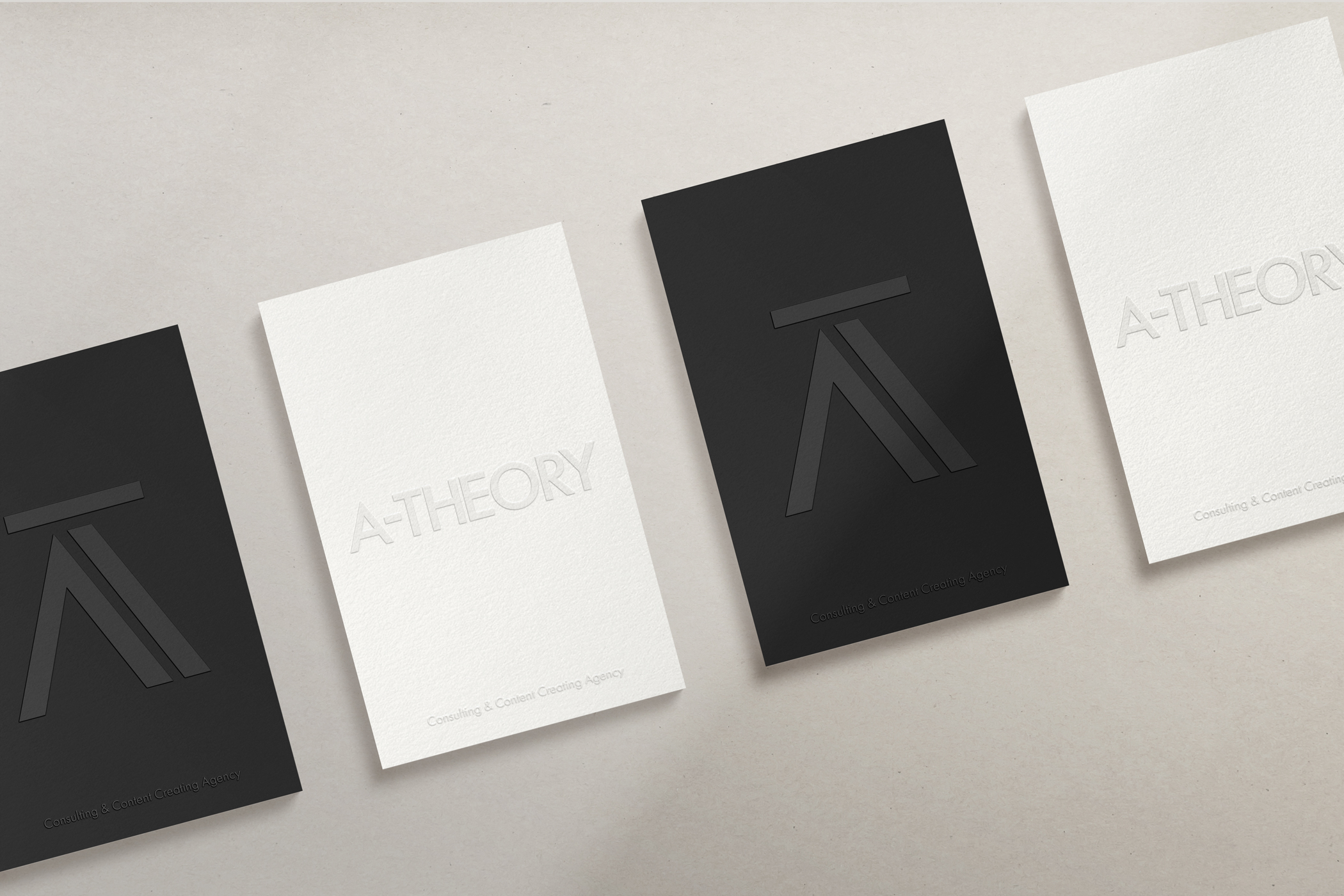
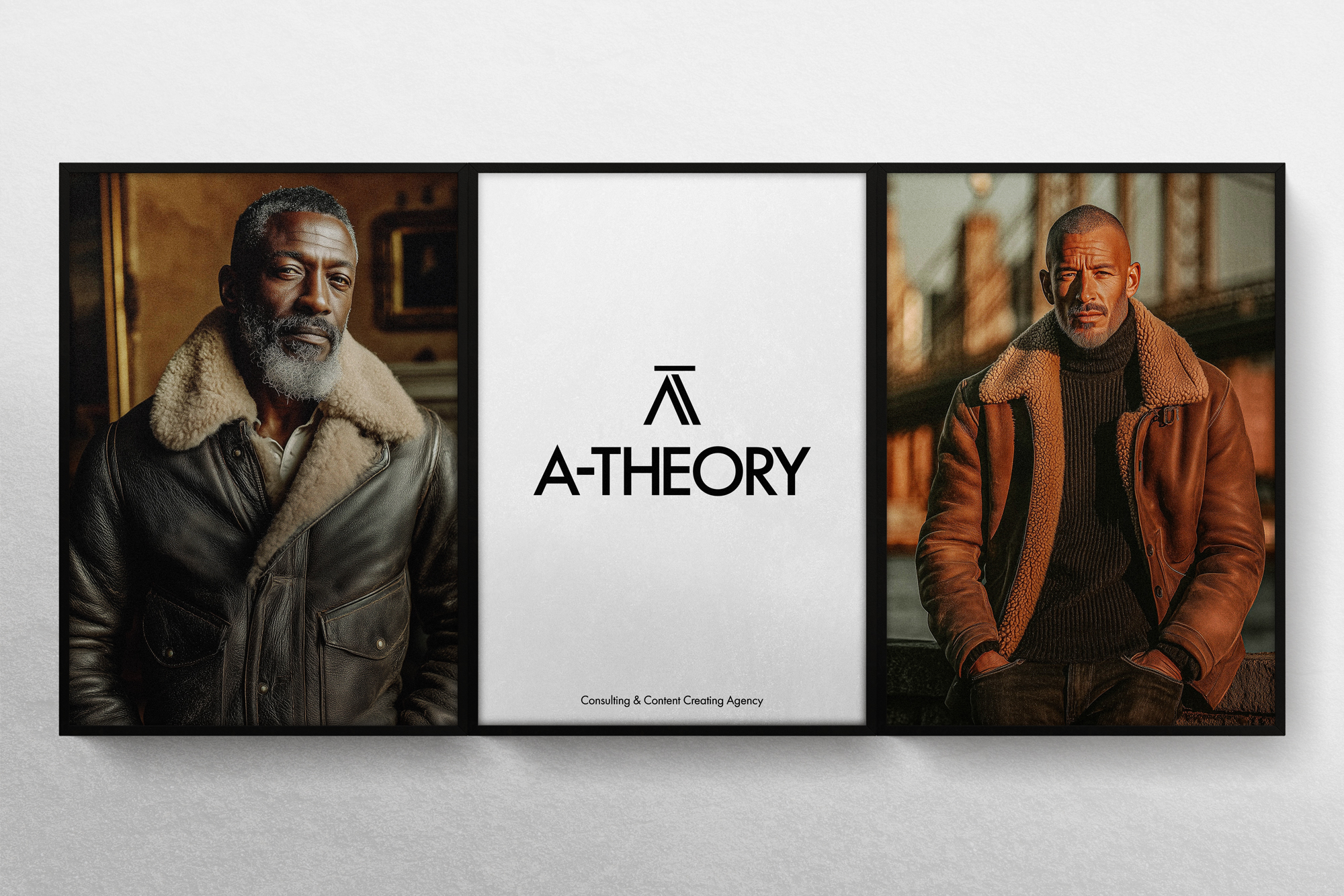
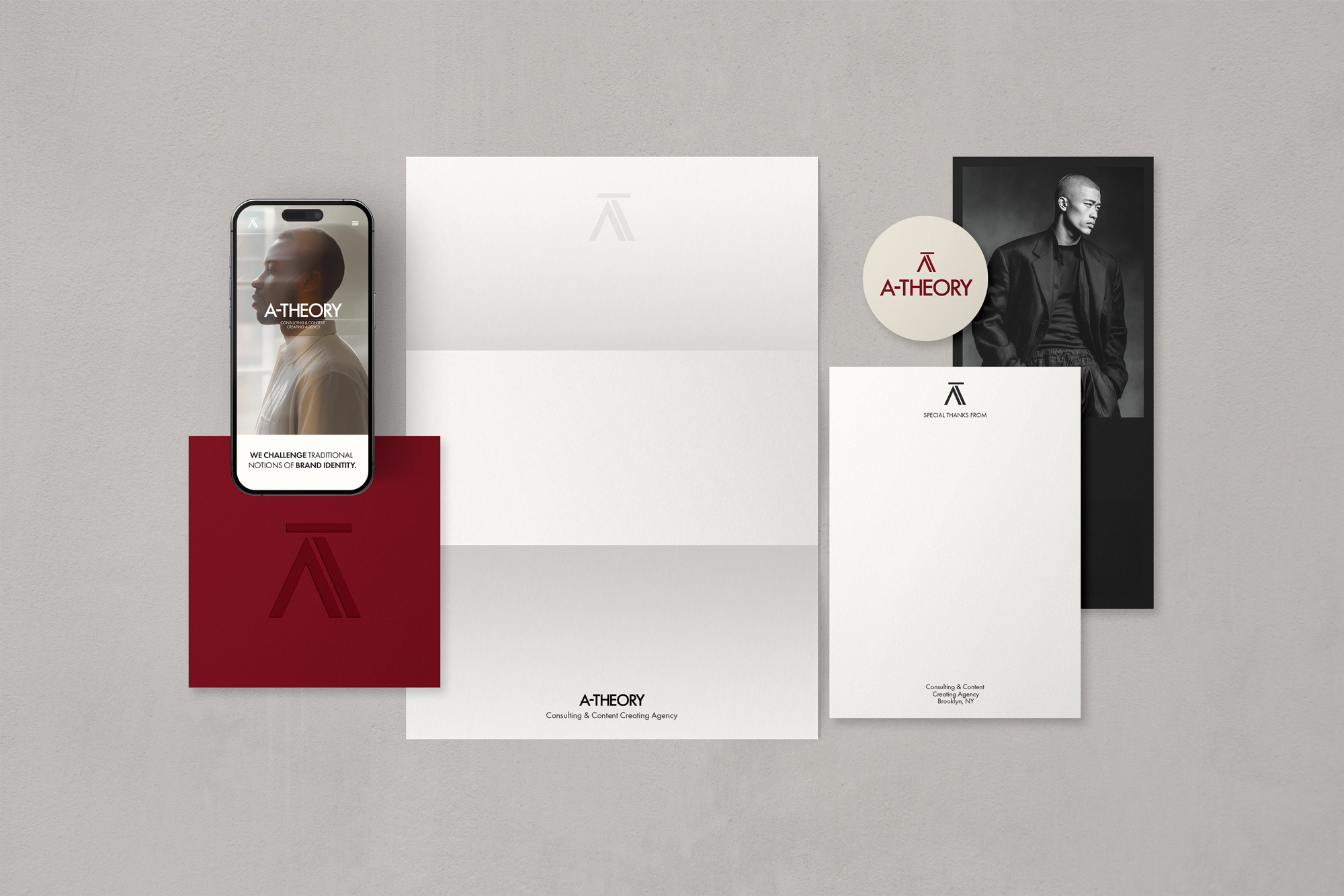
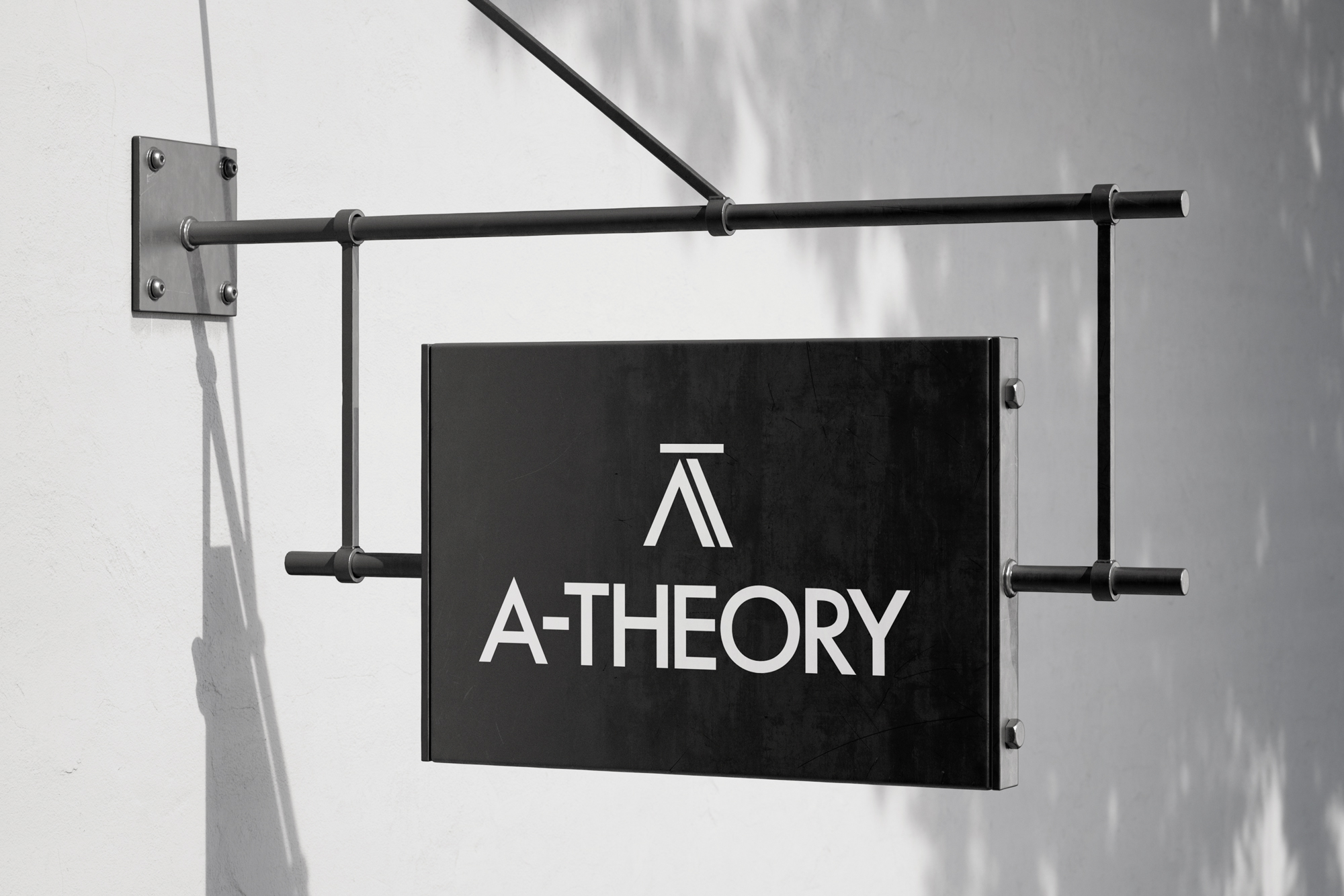
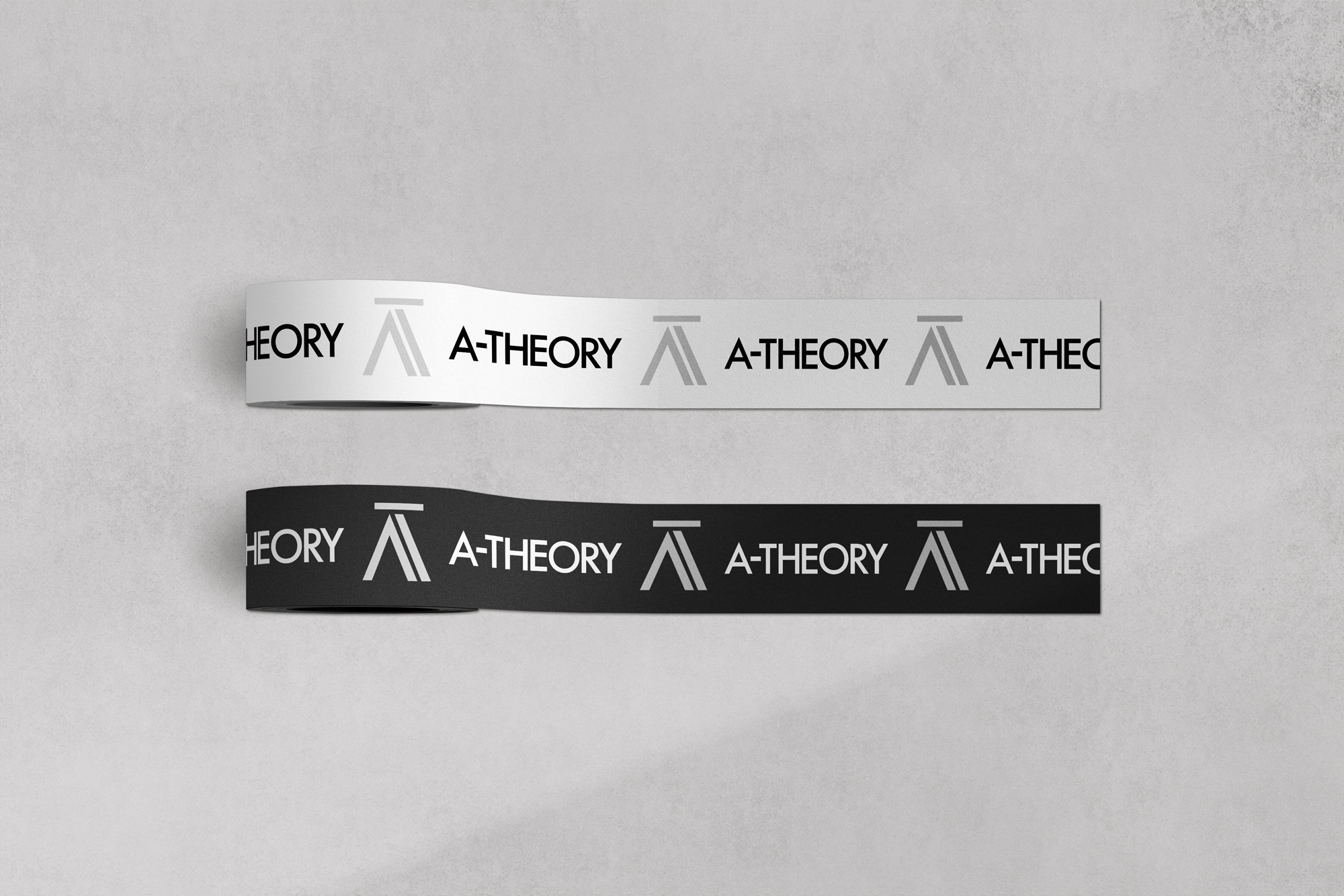
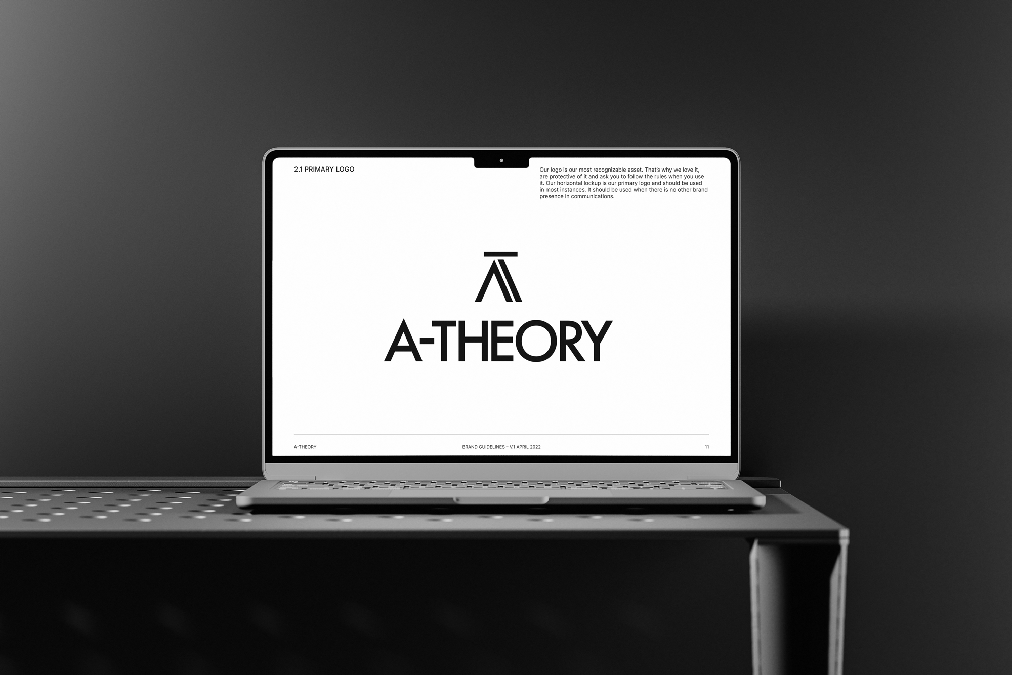
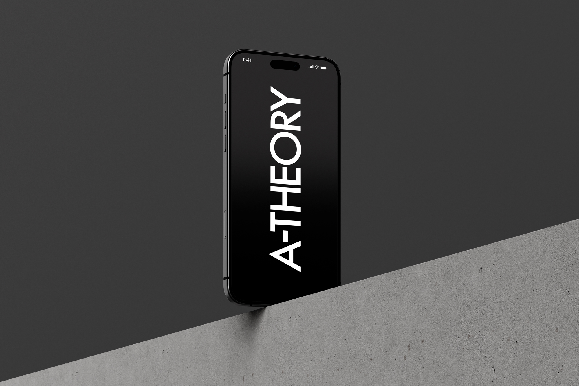
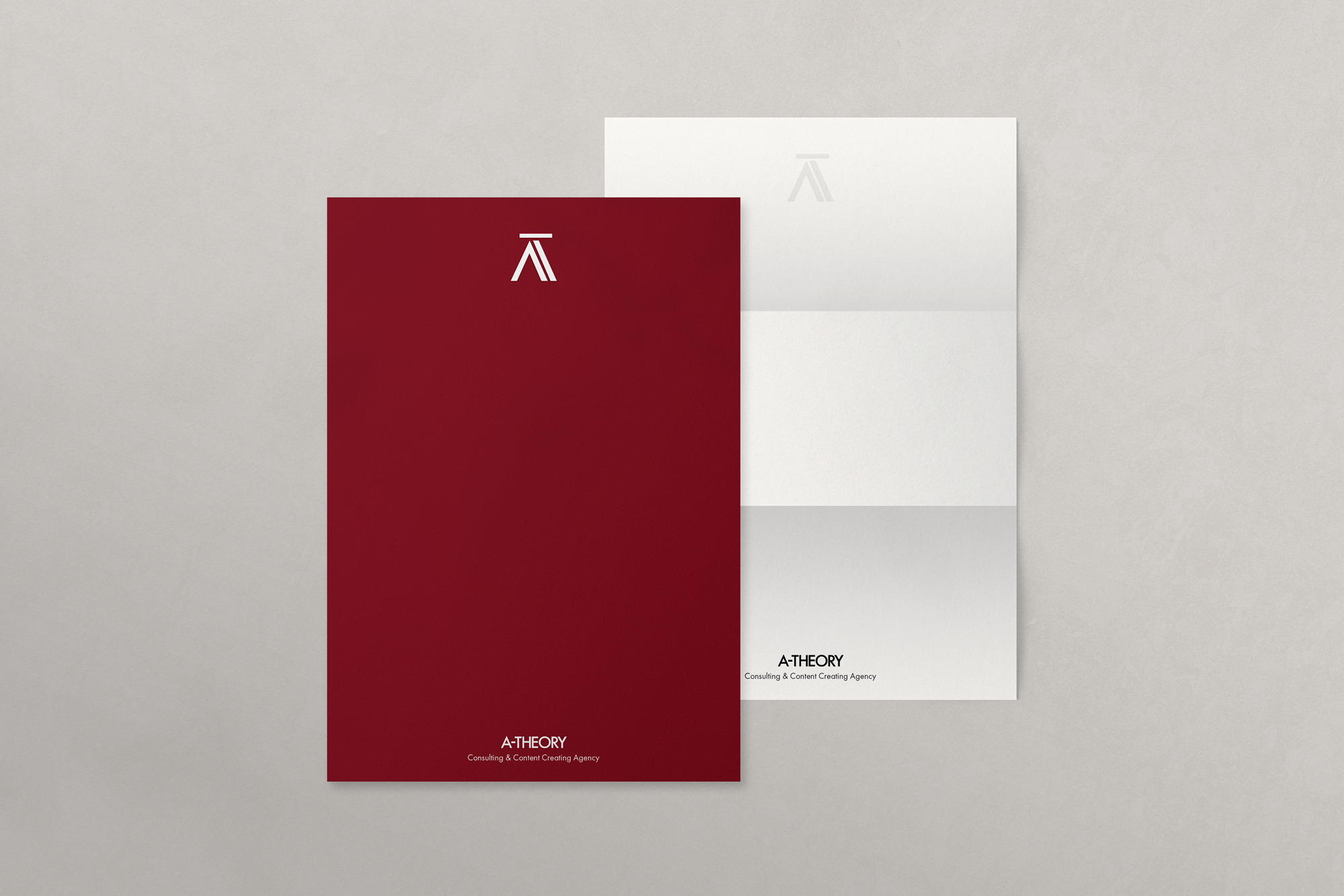
Brand Design

A-Theory

Project Overview

Role
Art Director

A-Theory is a branding project built around clarity, restraint, and a distinct visual point of view. I developed the identity through typography, composition, and art direction, creating a system that feels confident, minimal, and intentional. The goal was to build a brand language with presence—one that could hold its own across print, digital, and spatial applications.

⟣ Brand Concept & Visual Language

The identity was shaped through control of type, space, and pacing. I approached each element as part of a larger visual language, using restraint to create tension, clarity, and mood. Rather than overcomplicating the system, I focused on making each choice feel deliberate and connected.

⟣ Branding System & Design Approach

My focus was on building a brand that feels cohesive across touchpoints, not just in isolation. Typography established tone and hierarchy, while composition created structure and rhythm. The system was designed to feel clean and expressive without losing precision.

⟣ Art Direction & Brand Expression

I wanted the brand to carry a strong sense of atmosphere across its applications. From signage and print materials to digital mockups and apparel, each piece was designed to reinforce the same visual logic and presence. The result is an identity that feels consistent, considered, and visually grounded across context.

✦ Project Insight

For me, branding is about building meaning through visual systems. With A-Theory, the aim was to create an identity that feels clear, memorable, and conceptually strong—where typography, composition, and art direction work together to give the brand its own character.

Get in Touch

I’m open to art direction roles, creative collaborations, and opportunities where strong visual thinking and concept-driven design are valued.