A lookbook should be more than beautiful; it should be unforgettable.
In the world of fashion, a lookbook isn’t just a showcase — it’s an editorial manifesto. As an Art Director, I believe it should distill the essence of a collection into a story that lingers long after the last page.
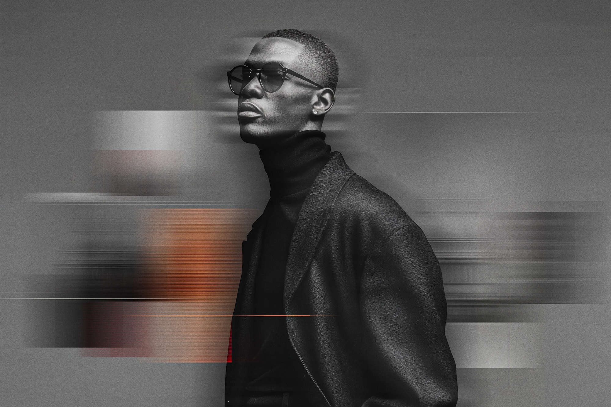
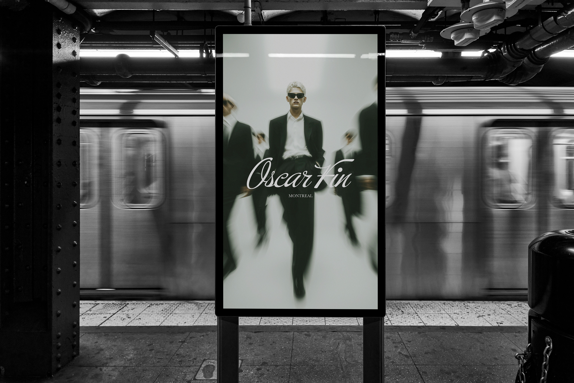
A lookbook is more than a visual catalog; it’s a curated experience that expresses the essence of a collection. It’s one of the most powerful tools a brand can use to communicate not just what they offer, but who they are. A great lookbook doesn’t just showcase garments; it captures the spirit of a season, an attitude, or a movement.
Whether working with an emerging designer or an established house, I always start with the story behind the collection. What inspired it? Who is it speaking to? What’s the emotional tone: romantic, bold, nostalgic, or minimal? Once the core narrative is clear, I build a visual structure around it. The intention behind the collection drives every decision: photography style, typography, color palette, and pacing. Without a clear vision or purpose, even the most beautiful images can feel disconnected.
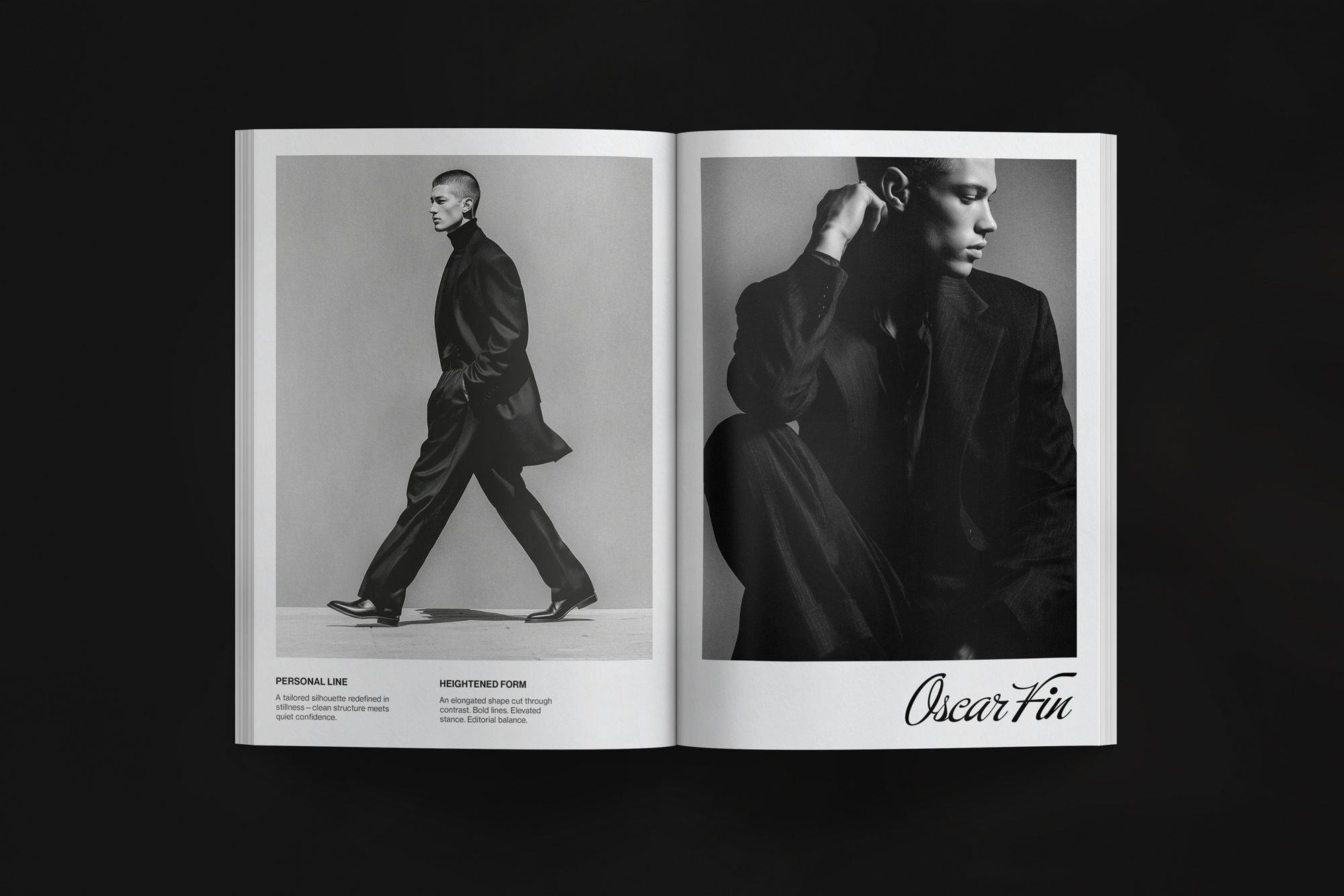
Pacing is one of the most underrated aspects of a lookbook. Like a great editorial spread, it needs rhythm. I often think of it like a film: the hero image sets the tone, followed by rising action (product variations, supporting visuals), and finally a resolution through detail shots or a closing gesture. Every spread should feel intentional, guiding the viewer through a visual and emotional journey. The interplay of full-bleed imagery and quiet negative space creates balance. Well-placed pauses, such as a single quote, a clean layout, or a bold image on its own, give the reader space to reflect. That’s what keeps them engaged.
Typography plays a key role. I select typefaces that reflect the collection’s mood, such as elegant serifs for timeless sophistication or sharp grotesks for bold modernity. The font isn’t just a detail; it’s part of the story. Headlines, captions, and body copy all work together to set tone and tempo. A well-chosen type hierarchy doesn’t just look good; it orients the reader and creates an intuitive flow that feels effortless.
Photography and layout are inseparable. I work closely with photographers to ensure every image fits into the larger narrative. The goal isn’t to document products in isolation, but to capture a mood and invite the viewer into a world. My role is to give the collection room to breathe while amplifying its personality through composition and sequencing. The most compelling lookbooks feel cohesive because every contributor (designer, photographer, stylist, and art director) is aligned around a shared vision.
At its best, a lookbook isn’t just a marketing piece; it’s an artifact that leaves a lasting impression. It builds anticipation, reinforces brand identity, and sparks desire. When designed with intention and care, a lookbook becomes more than a showcase. It becomes a story that people want to return to again and again.
I’m open to art direction roles, creative collaborations, and opportunities where strong visual thinking and concept-driven design are valued.